Sal
Hotel Baía Azul
Brand Identity
Graphic Design
2016
On the menu: the need to revamp and reposition a typical Italian hotel restaurant, one that used to cater to guests who weren't looking for an exquisite gastronomic revelation. The name was set: SAL, salt, the basis of all culinary experimentation and the source for many table discussions.
On Masterchef, this would be one of those ingredient-specific challenges: on the pantry, you find the restaurant, with a new opening, welcoming exterior guests; on the fridge, you find the look & feel of the previous space and on the oven? That is where the magic will happen and Blug will cook a new, welcoming and appealing brand.

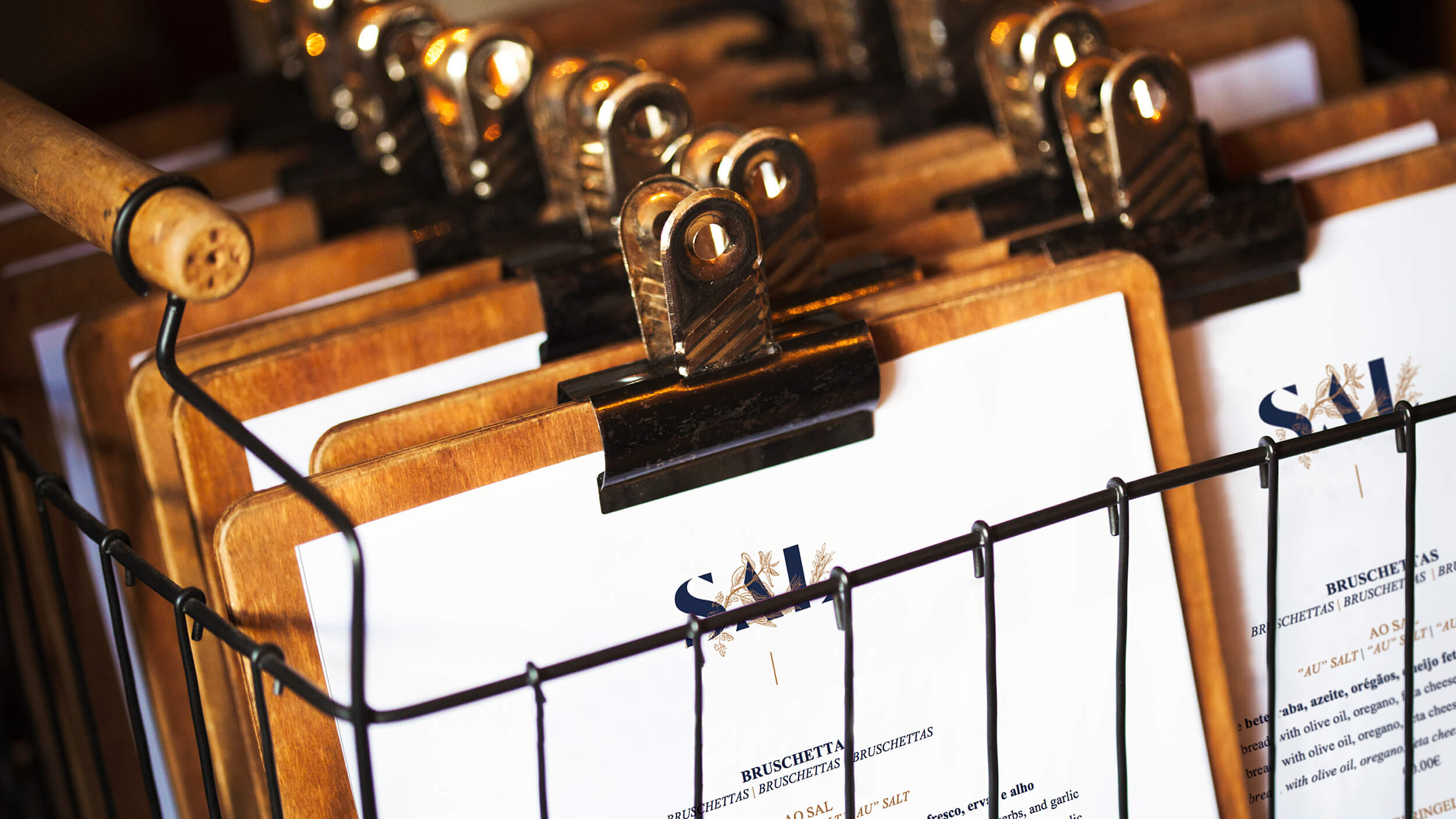
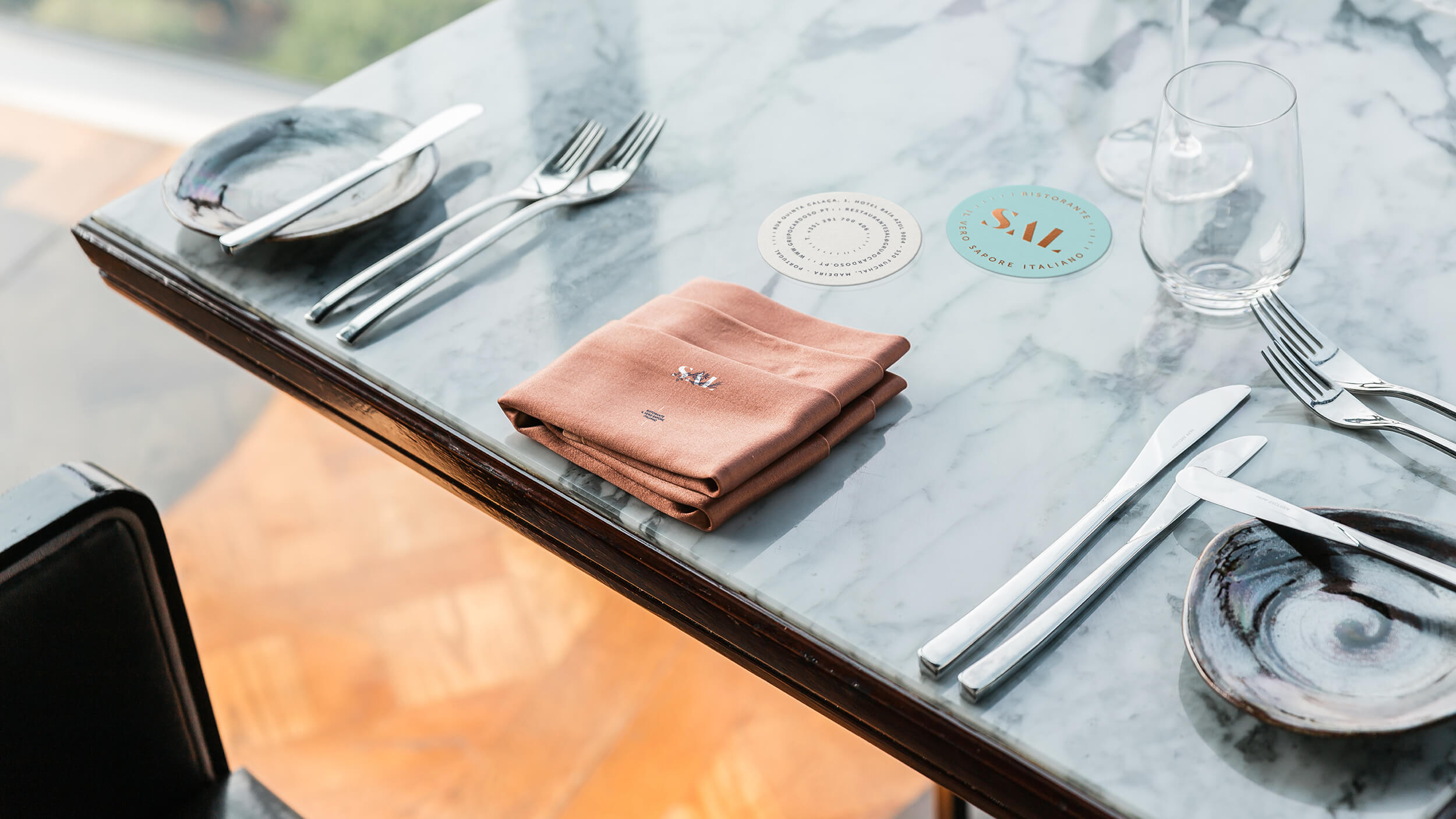
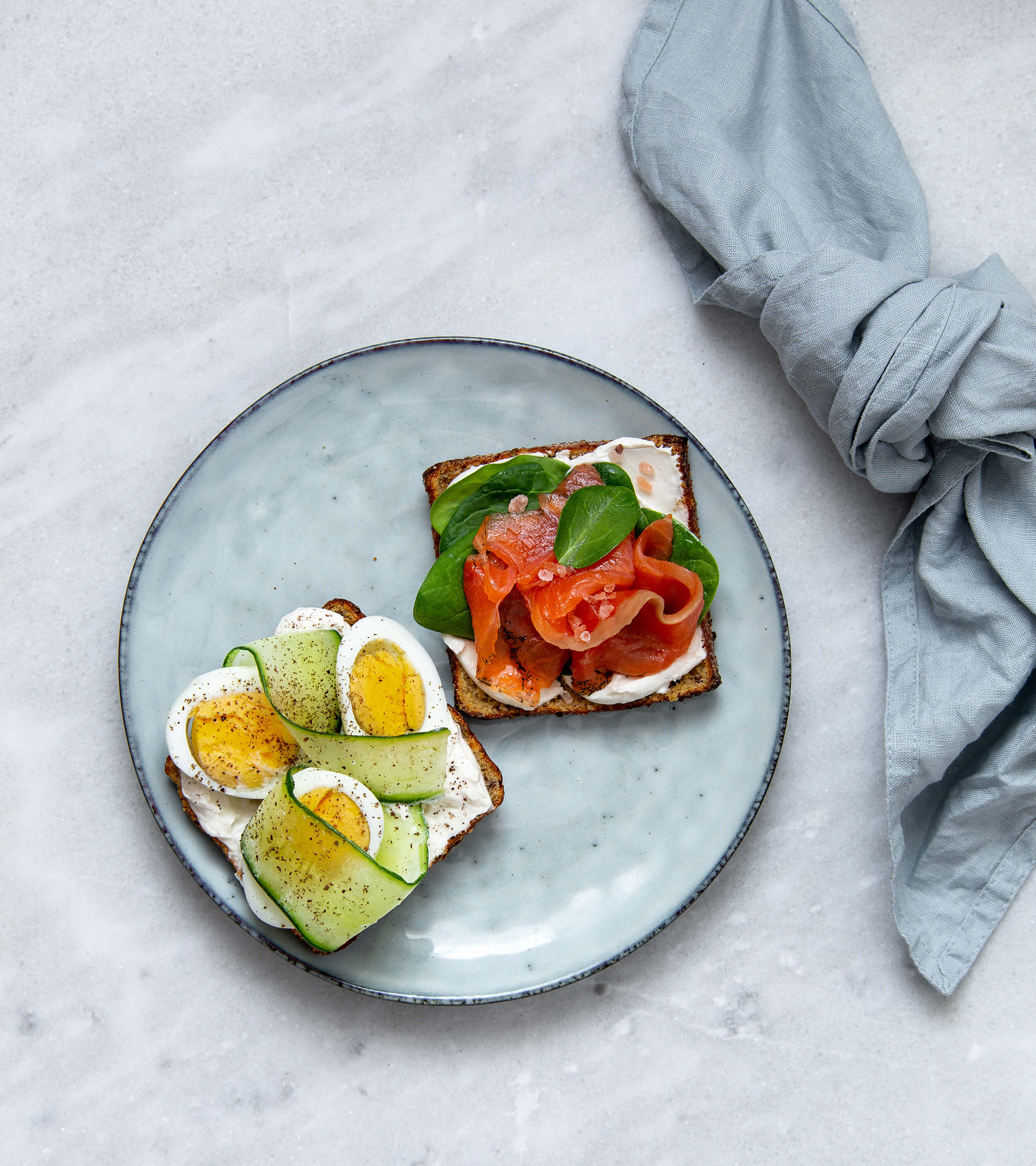
The same tones and colours were used through all graphic materials, from the menu clipboard and cup bases to the cloth napkins and general flower arrangements throughout the restaurant. The drinks, desserts and food menus were also defined and presented to create this visual plasticity, to make this a distinct and attractive venue.
We can say we succeeded. SAL became a true connection to culturally fresh flavours and to the essence of the food.
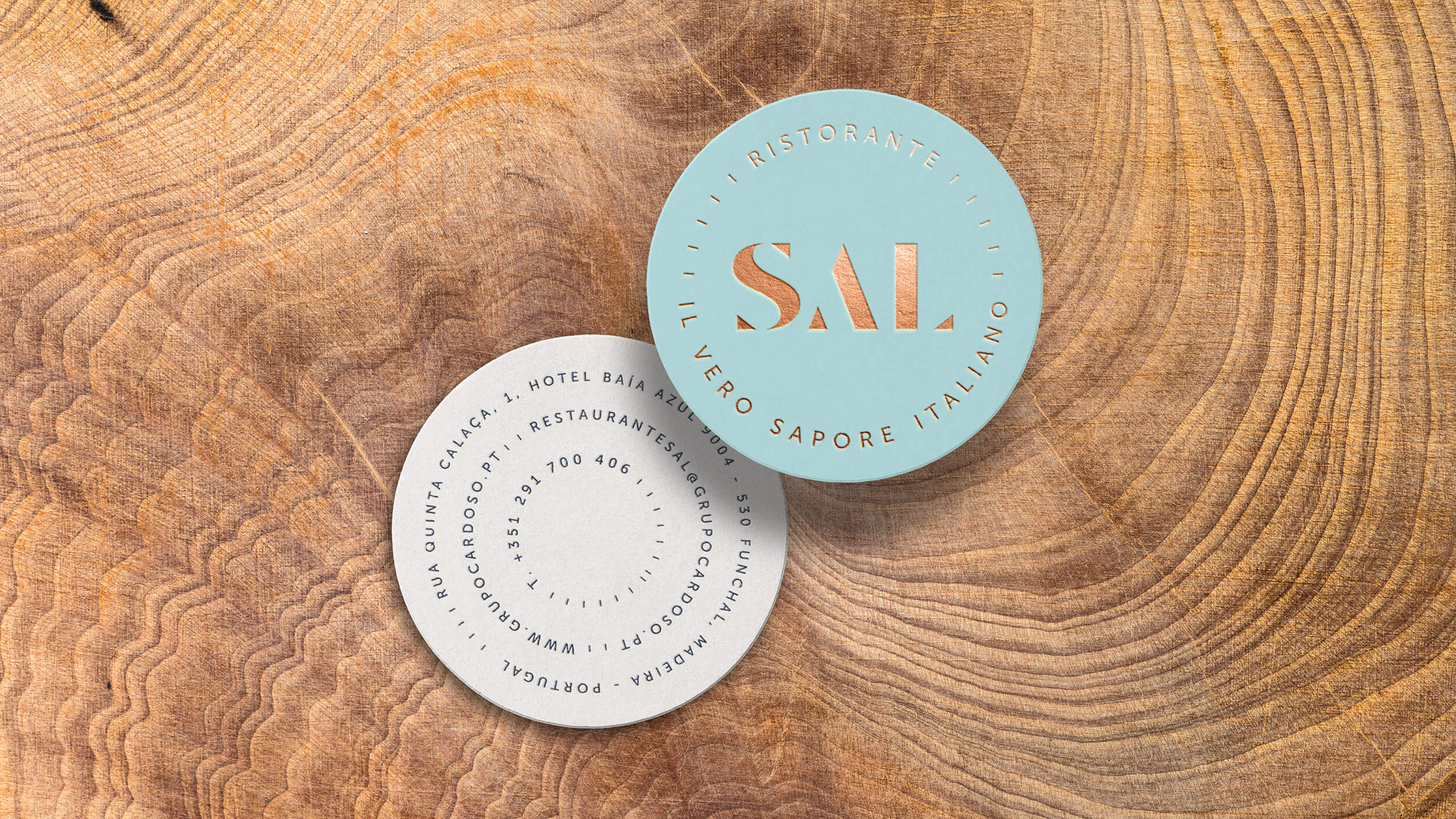
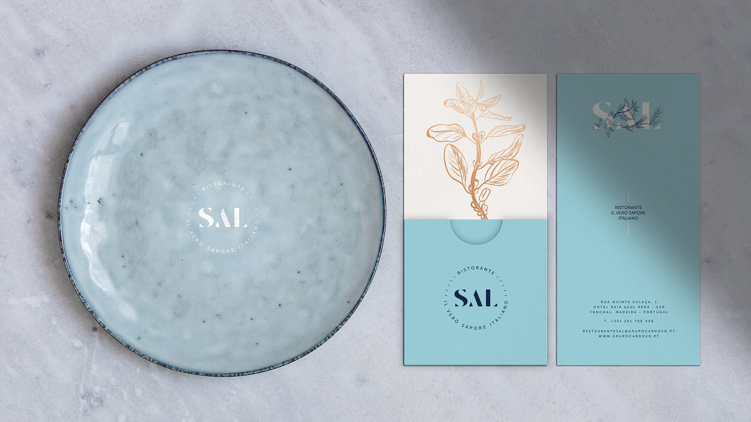
We combined the values of "authenticity", "familiarity", "freshness" and "flavour" and literally, intertwined them with our logo, showing that here is the place where you can find a perfect balance between salty and fresh herbs. The spacing of the typography evokes the refined plate presentations you can find at high-end restaurants.
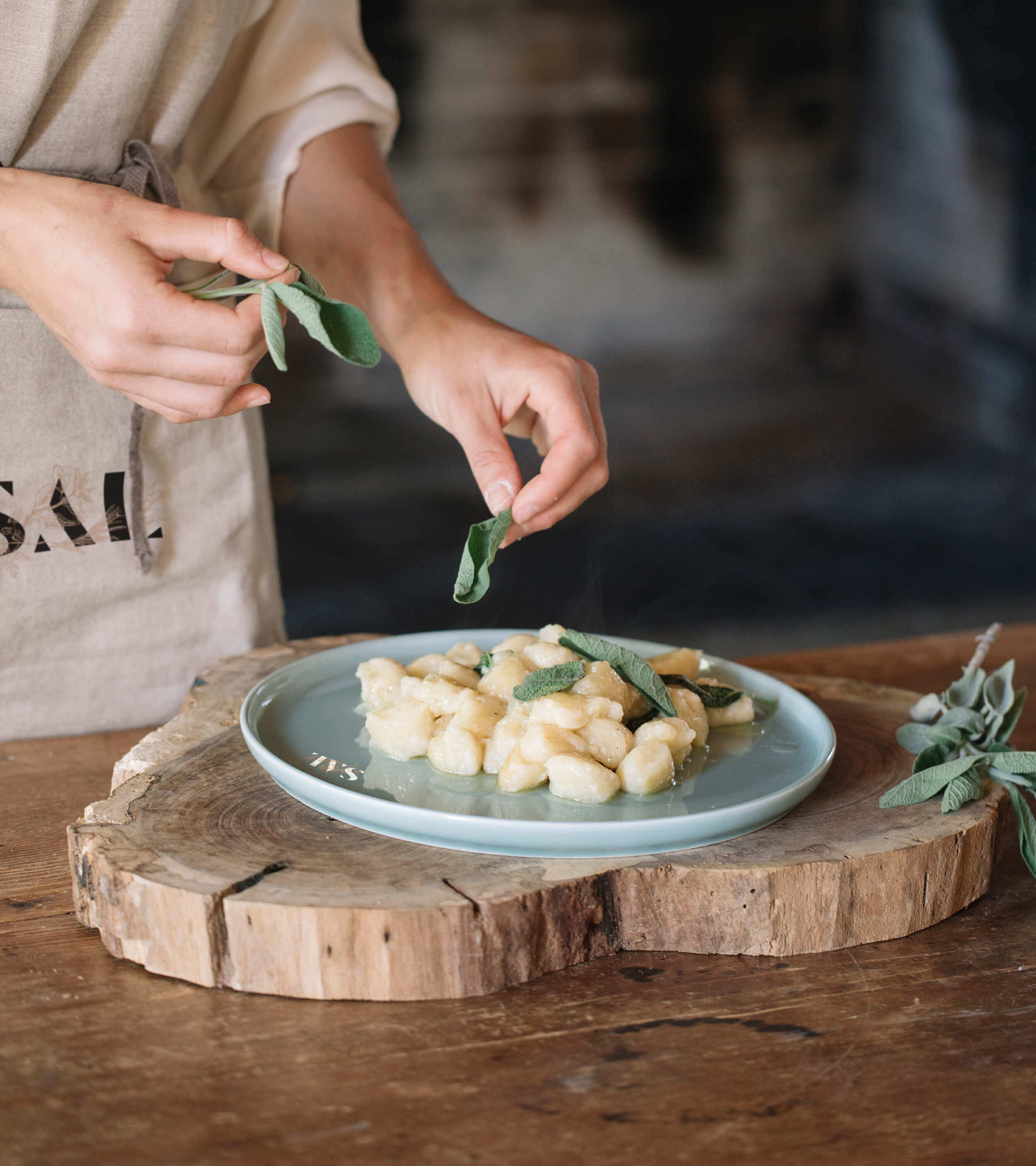
Contemporary and essential tones and colours were chosen to remind us of salty tones, wood warmth and metallic coppers, colours usually associated with Italian cuisine. The freshness of the sea also represents this restaurant's love of fish and of its presentation.


An authentic Italian gastronomic experience is to be derived from this: a brand celebration of fresh ingredients and essential flavours. The brand signature was created to add the Italian character to the name of the "ristorante": from the basis of gastronomy to one of the most beloved flavours: a true Italian flavour.
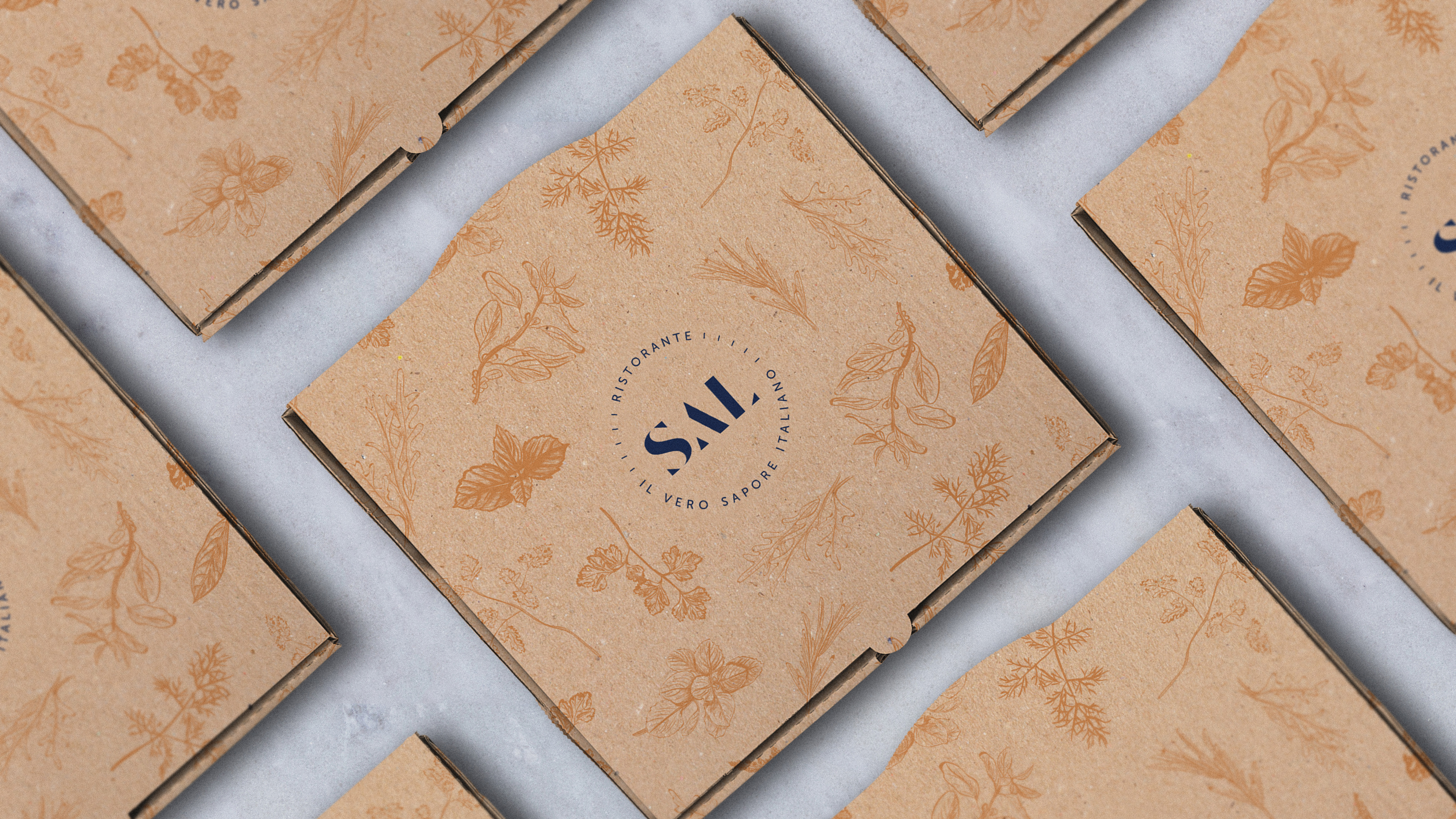
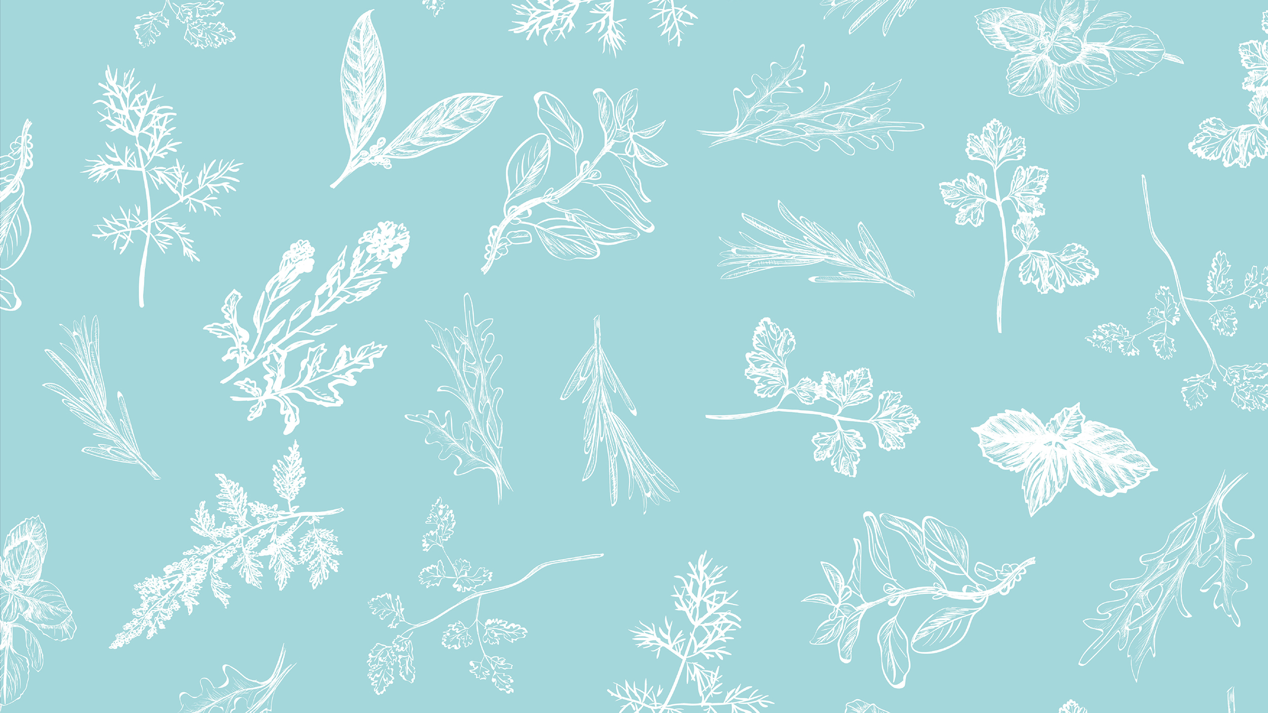
We also searched for the three most commonly used aromatic herbs - Basil (one of the main flavours in Italian cuisine), Rosemary (with a fresh, sweet and strong scent that permeates "Nonna's" recipes) and the eternally present Parsley and used their illustrations to add character and variety to our graphic exercises.
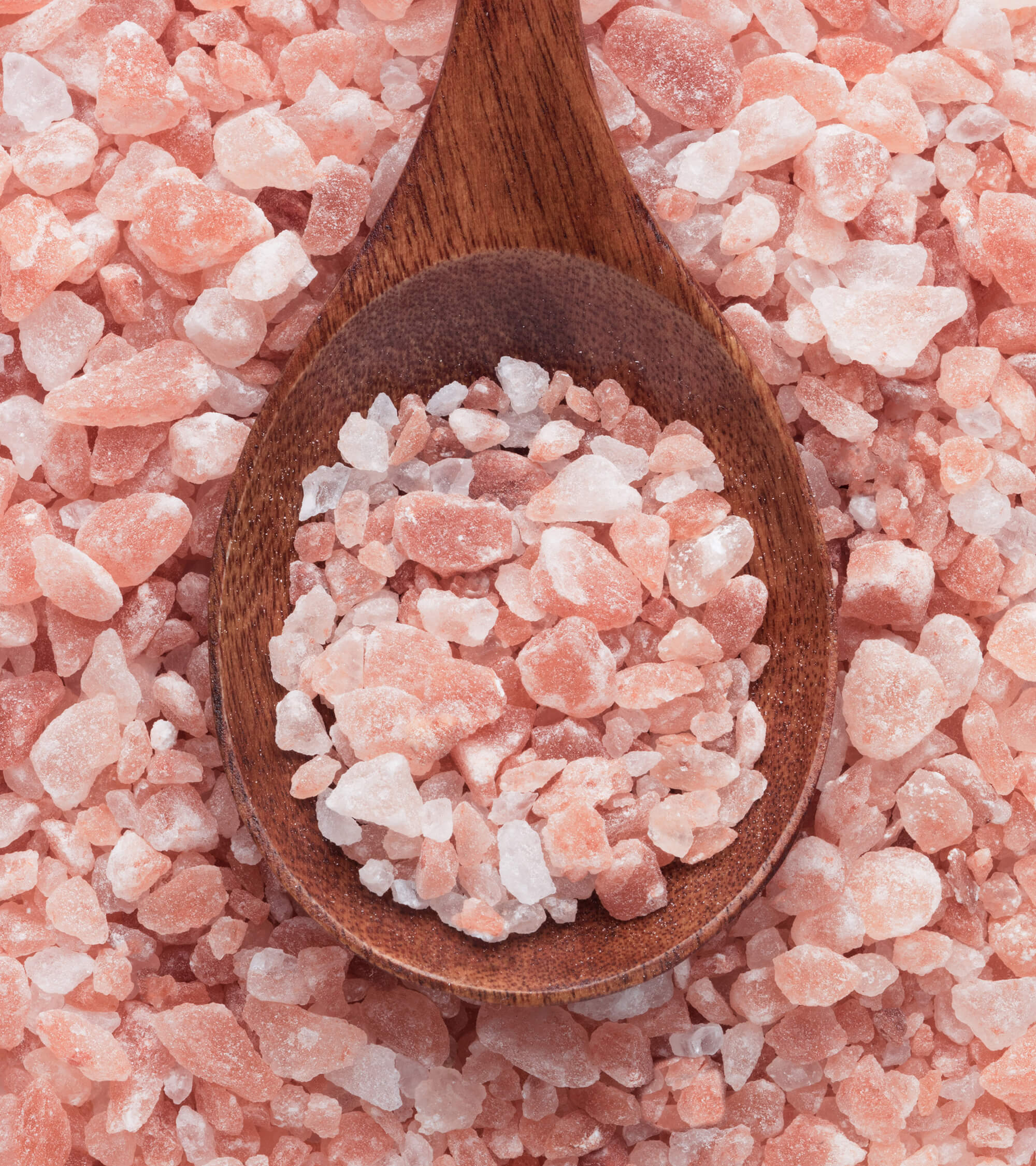
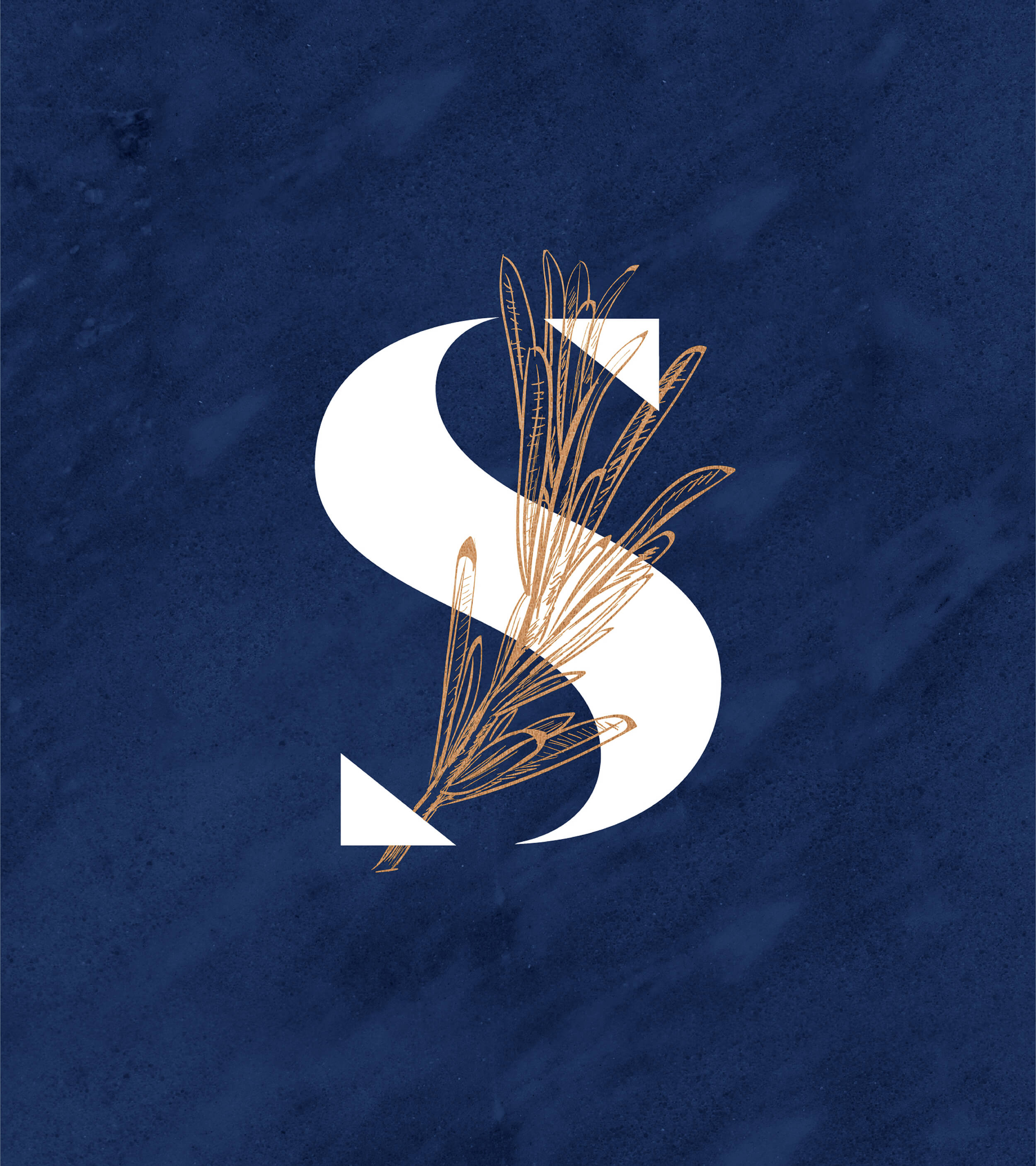
At BLUG, we decided to work from the basics: if the name was set, then it should provide the structure and the narrative to build a brand essence. And the essence was on the simplicity of salt sprinkling, the singular identity that could be harnessed from the randomness of the salt patterns that shine on top of all culinary concoctions.
We created that identity. As in all our branding projects, our logo and font were created and designed, thinking of these specific patterns and of the specific geometry of the salt sprinkling. This allowed us to define the nature of our brand and present a sophisticated look & feel for the whole restaurant.
Salt can awaken the deepest memories of food staples. It elevates flavours, creates new feelings and evokes moments. When combined with aromatics and herbs, the ones so near and dear to Italian gastronomy, a whole country memory can be created in a gastronomic journey.